Putting Our Face On: The Oxford Hills’ Logo Reveal
Drumroll, please!
Big news: today we reveal The Oxford Hills’ brand identity—our shiny, fresh, and completely original logo!
If you’ve been following our journey, you’ve hopefully noticed how the various pieces of the puzzle are slowly coming together. (Perhaps you’ve already seen the hints on our website—the colour palette and typography, and possibly on our social channels as well—Facebook, Instagram and Twitter.)
Now that it’s official, here’s an inside look at the method and vision behind it all!
The Process
After picking our name, it took a couple weeks to determine our visual identity. Initial discussions resulted in five brand keywords: simplicity, elegance, graphical, modern, and confident. We put together a creative brief that included reference materials (clubhouse interior and exterior renderings, celebrity, animal, and even car-based inspirations) as well as brand themes (style guide, target audience, brand personas).
Next, we were off to the races! With a clear visual direction established, our main goal became designing an eye-catching graphic element that tied everything The Oxford Hills will become together (such as our golf course, restaurant, and other future initiatives—microbrewery, events and wedding venue).
Once that was established we turned our focus to defining clear guidelines as to how these visual elements should be used throughout our brand touchpoints.
After a few rounds of revisions, we arrived at an emblem we think will stand the test of time…
Ta Da!
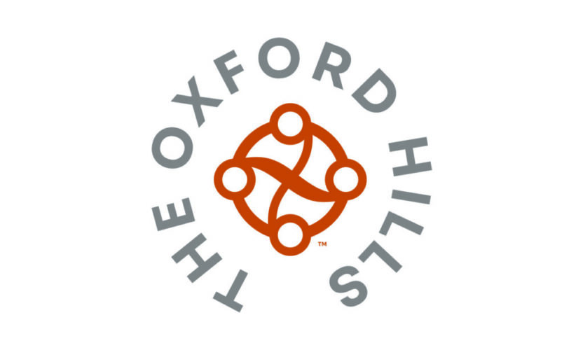
Meet our brand-new logo (and all its variations – each used as appropriate across our different touchpoints)!
After a 6-week process and many iterations, we couldn’t be happier with the wordmark and logo we’ve chosen to begin building our brand. It isn’t only elegant and unique, but tells a compelling story:
In honour of our roots, our new logo is designed to reflect the establishment’s name and landscape – the O and X of “Oxford” County and the flow and bend of the hills upon which the course is set. The four “O’s” around the logo each represent a pillar of the business – golf, fine-dining, events, and brewery.
The logo’s symmetry implies balance, while the asymmetrical lines imply action, a project always in progress—permanently evolving to serve our community in the way it deserves to be served.
We are thrilled to have this symbolic reminder of our values and principles, and to unite ourselves under that banner in all we do at The Oxford Hills.
Here’s what owner, Steve Bohner, has to say about the logo:
“We wanted to capture the spirit of this project in visual form—not easy to do considering our long-term vision. But, I think we’ve found a logo and branding that not only does that but also does a wonderful job representing our community.”
We hope you’re just as excited about the logo as we are!
STAY UP-TO-DATE
Interested in the latest and greatest? Curious about what’s next? Join our mailing list.

